Overview
HEALTH COMPANION APP
WE TESTED THE WIREFRAMES BEFORE DESIGNING THE UI
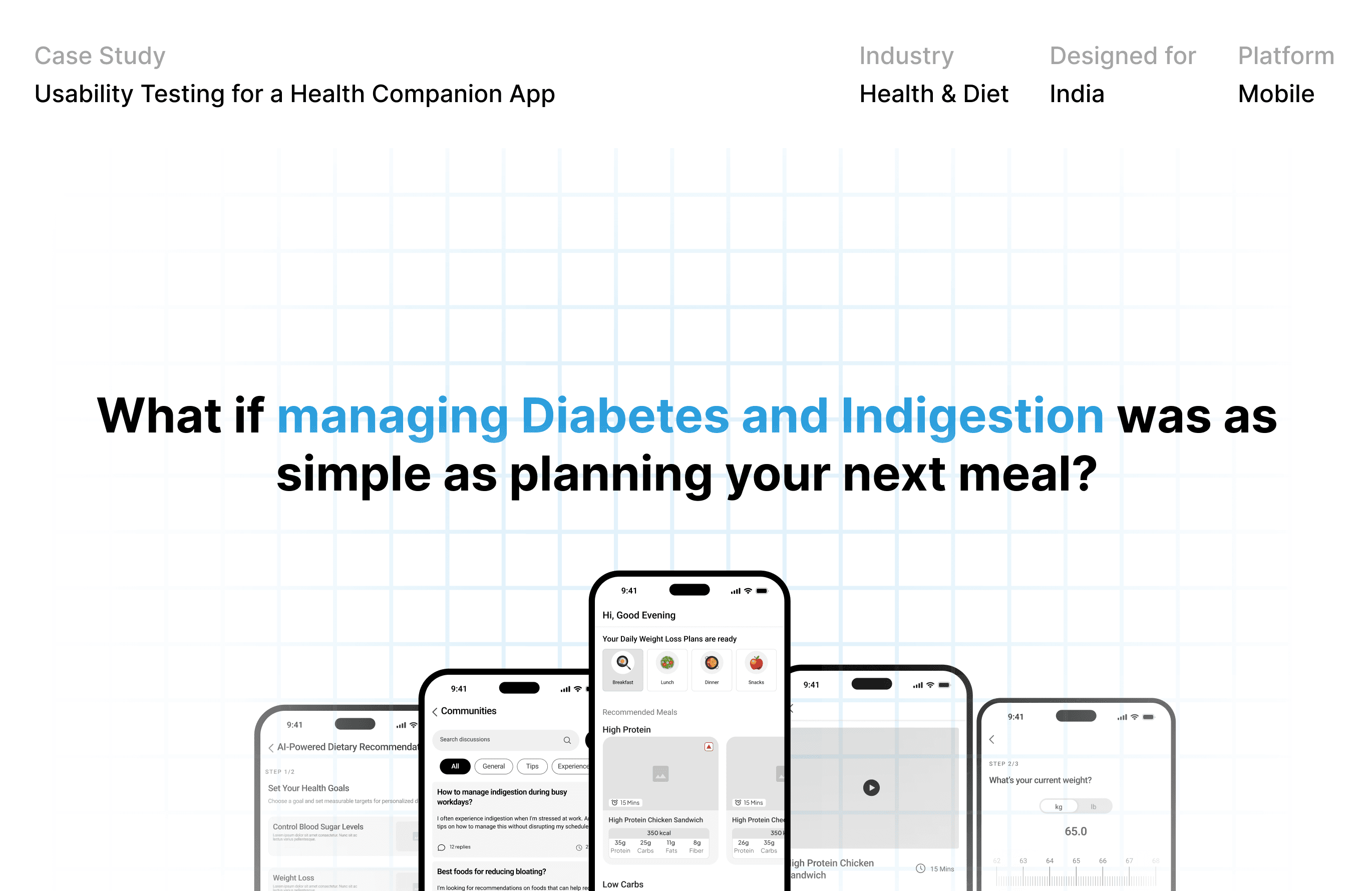
A mobile app for people in India managing diabetes and indigestion, with AI-guided meal recommendations, health tracking, a digestive-health hub and virtual dietitian support.
This case study covers one stage of a team project: usability testing of the wireframes, before visual design. I was team lead for UX research and usability testing.
Role:
Team lead, UX research & usability testing.
Team:
6 members
Tools:
Figma, Google Meet, Docs, Sheets,
THE CHALLENGE
SIX FEATURES. THE FIRST TIME REAL USERS WOULD SEE THEM.
Diabetes and indigestion are widespread in India, and poor dietary management leads to complications and out-of-pocket healthcare costs. The team's response was a companion app that makes everyday eating part of managing health.
Before visual design, we needed to know whether the features worked for the people using them: could they finish key tasks quickly, and would they trust what they saw?
How testing happened:
12 participants joined remote sessions of 30–60 minutes in English, Hindi and Telugu. Each feature had five tasks. Every task had a script, follow-up questions and a pass criterion defined up front.
WHAT TESTING CHANGED
CHANGES, EACH TIED TO WHAT PARTICIPANTS DID OR SAID.
Across the two features documented here, the Digestive Health Hub and AI-Powered Dietary Recommendation:
1. Articles people can scan
Finding: all three participants who tested articles asked for a quick summary at the top, since busy readers won't scroll a full piece.
Change: a "View Summary" option with key takeaways at the top of each article.
2. Videos people can navigate
Finding: participants wanted to preview a video and jump to the part that mattered.
Change: chapter timestamps (causes, remedies, when to see a doctor) under the video.
Infographics and data visualization
Custom illustrations and icons
3. Confidence after every action
Finding: one participant couldn't tell whether a discussion reply had posted. Sharing was the lowest-rated task (3/5, rejected by 1 of 3), because people didn't know which platforms were available or how shared content would look.
Change: an on-screen confirmation after posting, and a share sheet with platform options and a preview.
Webflow development and customization
Website maintenance and updates
4. Meal plans that bend
Finding: adjusting a plan was the weak point of the AI feature. One participant rejected the task, and users found no seamless way to exclude ingredients or set constraints.
Change: a "View Alternative" button to swap meals, and a filter panel (nutritional goals, cooking time, cuisine, calories, budget and more).
Typography and color scheme selection
Brand storytelling and messaging
What already worked: profile setup, progress tracking and infographic download scored 4–5 out of 5 with no rejections.
THE OUTCOME
KEEP WHAT WORKED. FIX WHAT DIDN'T.
Across six features, 82 of 90 task attempts were accepted, with average ratings between 4.2 and 4.6 out of 5.
The friction that did appear was consistent: most of it wasn't about finding things, it was about confidence. People were unsure whether a reply had posted, what a share would look like, or which meal to pick.
Updated wireframes for both features now carry these fixes, and visual design is the next stage.



Still Want To explore
it In Detail ?
Task scripts, task-by-task results, participant feedback and before/after wireframes.
© More case studies
UX
Diversity
Other Projects
A showcase of my latest projects, highlighting thoughtful design, clear strategy, and impactful results.