Overview
BUILDING A HEALTH APP UI FROM THE REAL WORLD.
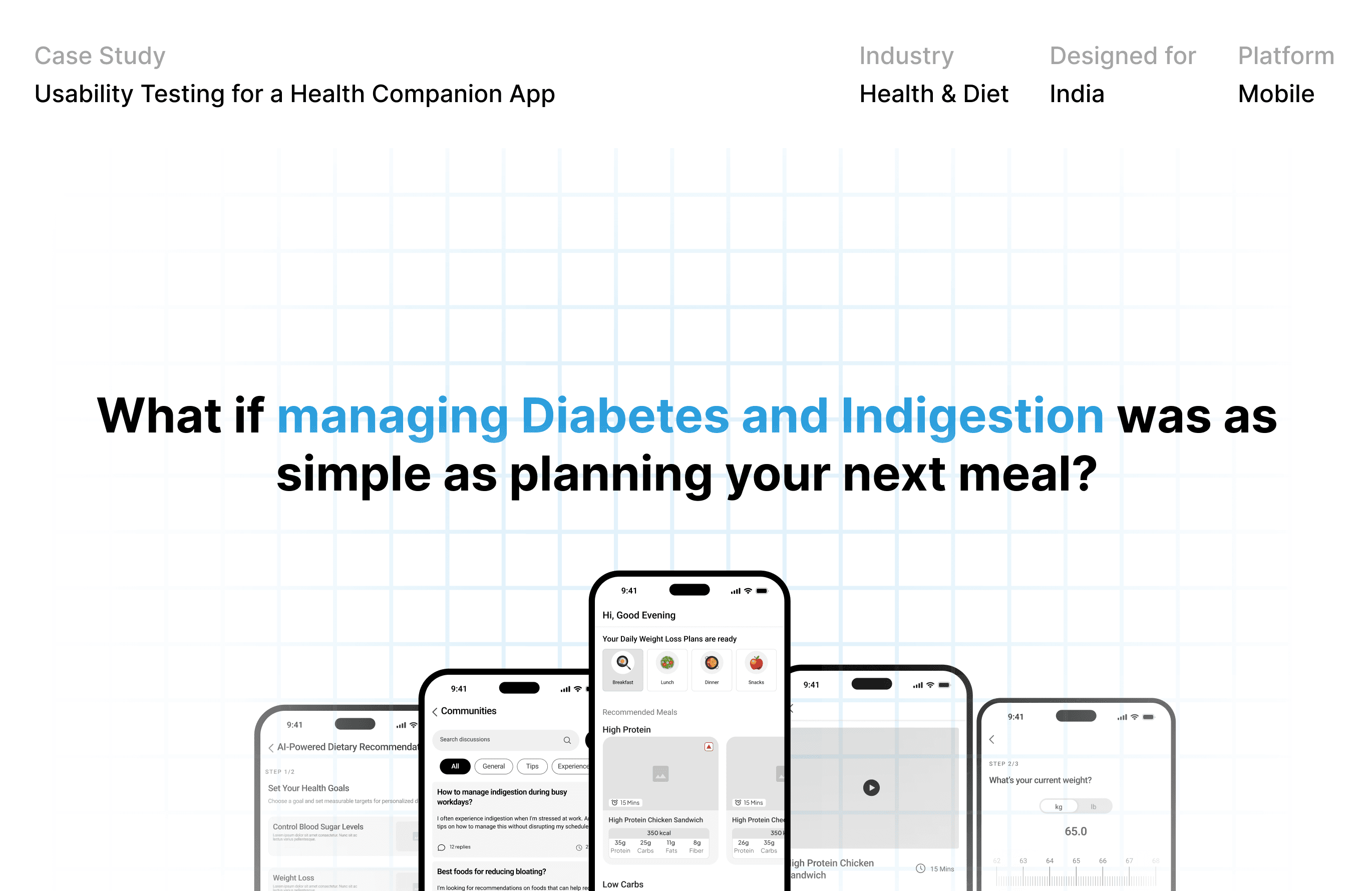
A visual design exploration for a health and diet mobile app, designed for India. I started with the real world, from clinics and kitchens to glucose monitors and traditional Indian meals, and translated what I found into a system of 14 UI components.
The goal
An interface trustworthy enough for health data and appetising enough that healthy eating feels inviting.
Visual design execution:
Health & Diet · Designed for India · Mobile · Role: Product Designer
THE CHALLENGE
HOW DO YOU MAKE HEALTH DATA FEEL CALM, CLEAR AND APPETISING?
This project had no user problem to fix. It had a design question, how should an app that tracks meals, and connects people with dietitians, look and feel?
Three tensions shaped the direction:
Health meets flavour
Nutrition guidance that still makes food look worth eating.
Clarity meets chaos
Calories, macros and trends without overwhelming the screen.
Trust without anxiety
Calming, muted colour instead of alarming brights.
INSPIRATION TO INTERFACE
EVERY COMPONENT TRACES BACK TO SOMETHING REAL.
For each of the 14 components I ran the same loop: research the usability principles, collect real-world references, distil the common thread, baseline it into a spec. Three examples:
1. Colour
Reference: photos of care and food, with swatches pulled from each.
Decision: blue as primary for trust, green as secondary for freshness, soft neutrals to balance, and a limited palette so calls-to-action stand out.
2. Spacing
Reference: measuring tape, weighing scale
Decision: a baseline scale in 2px and 4px steps, from 4 to 56px, so every gap has a reason.
Infographics and data visualization
Custom illustrations and icons
3. Navigation
eference: labelled shelves and price signs.
Decision: a bottom bar limited to top-level destinations, each with a 24px icon, a 12px label and a clear active state.
Webflow development and customization
Website maintenance and updates
THE OUTCOME
A VISUAL LANGUAGE WITH A REASON BEHIND EVERY CHOICE.
The result is a documented visual language, mapped onto the app's core screens: a dietitian profile, a progress dashboard and a daily meal plan.
14 components, one method:
Colour, type, icons etc, everything derived from natural exploration and imagination. Along with taking note about design principles.



© More case studies
UX
Diversity
Other Projects
A showcase of my latest projects, highlighting thoughtful design, clear strategy, and impactful results.